No products in the cart.
Label Resources
What is Opaque White
If you are printing on clear material, silver or gold material, or any coloured materials you need to understand the relationship of inks with materials.
Most printing inks have a degree of transparency.
Normally this is ok as you print on white materials. The degree of transparency can depend on the ink type (water based or uv) and the method of printing. (eg. Digital inks can often be transparent but screen printed inks are much less transparent).
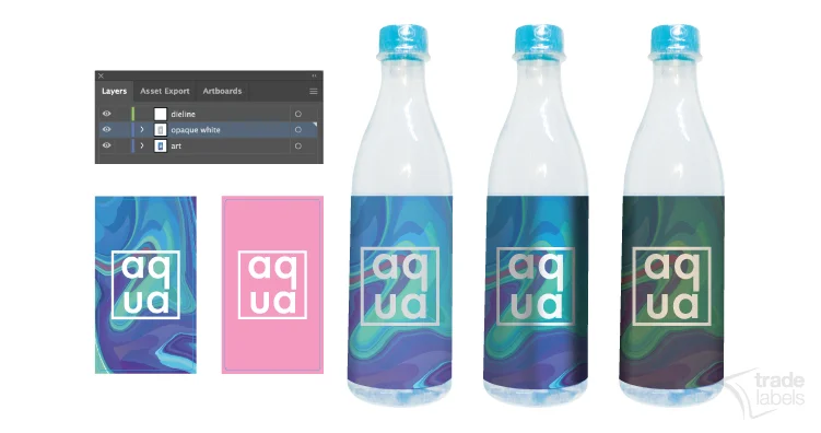
If you print on a base that is not white – the ink and subsequent look on the end product can be affected. This is because white is reflective, hiding the colour underneath and bouncing the light back to the surface to show the colour. Here is how:
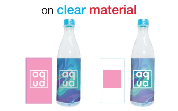
Clear Materials/Stocks
- Opaque white is used under print colours to make them less or non-transparent.
- Sometimes in digital print a ‘double or 2xOpaque White is needed’.
- It makes the printed areas look like they ‘float’
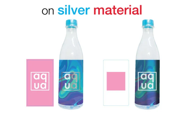
Silver or Metallic Materials/Stocks
- Opaque White is used under print colours to make them less or non-transparent – resulting in a ‘shiny’ or metallic appearance.
- Note that printing colours on metallic base makes them darker if no opaque white is used.
- Varying the percentage of opaque white used can create contrast in ‘shiny’ to less shiny effects.
- This is often used for labels instead of hot foil stamping for cost considerations.
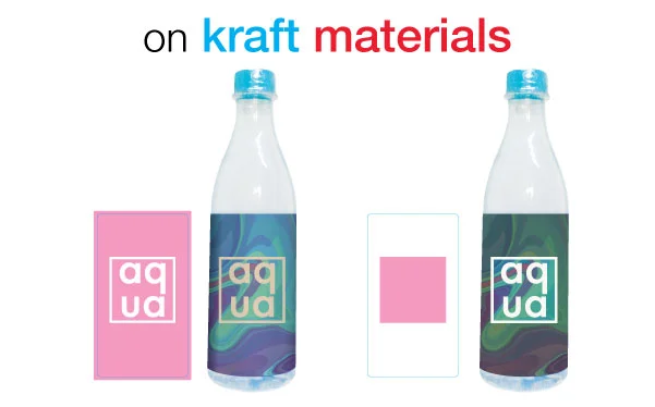
Coloured Materials/Stocks
- Opaque White is used under print colours to make them truer to their original colour.
- Darker based stocks will absorb light in inks and make them a duller, less vibrant colour.
- Sometimes this is used for Black or Kraft stocks to make them look premium or more ‘natural’, but sometimes you don’t want that – so you layer white under it to keep the colour stronger and more vibrant.
How to set up Opaque White
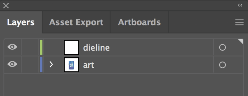
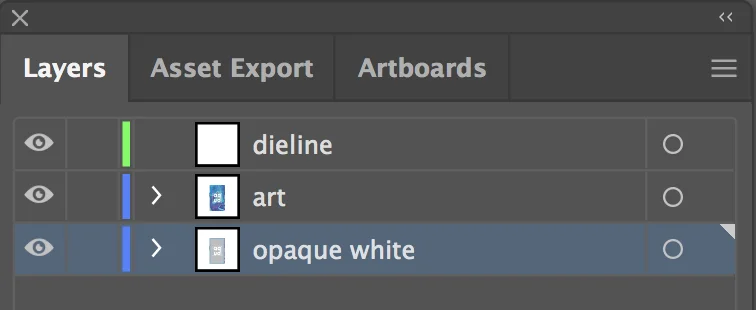
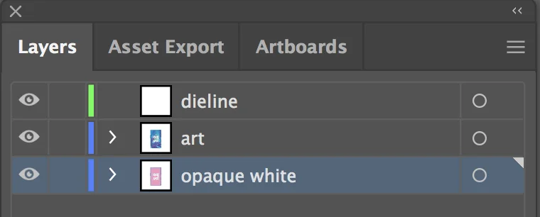
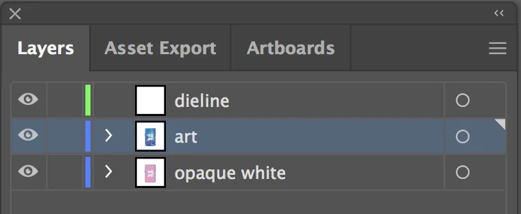
- Opaque White layers should be created in your art file (ai or eps) as a separate layer.
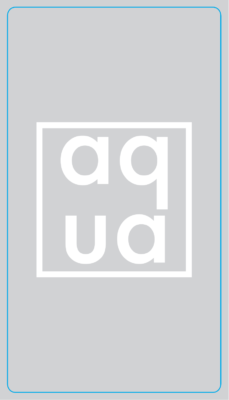
- They are usually created not as the colour white – but as a light pink colour – to indicate that is the layer that is being created.
- Leaving print areas white on files usually means that NO ink is used – and the stock from underneath will show through. (which is ok if it is white – but must be considered if it is another type of stock)
When designing you may not really see how this works in the design, but if you are using one of the above alternatives to white – you must consider it – or the impact can result in something you weren’t expecting. - Opaque white is printed first or underneath the other print colours, creating a light barrier to the substrate or end-use surface underneath.
Step 1
|  |  |
Step 2
|  |  |
Step 3
| 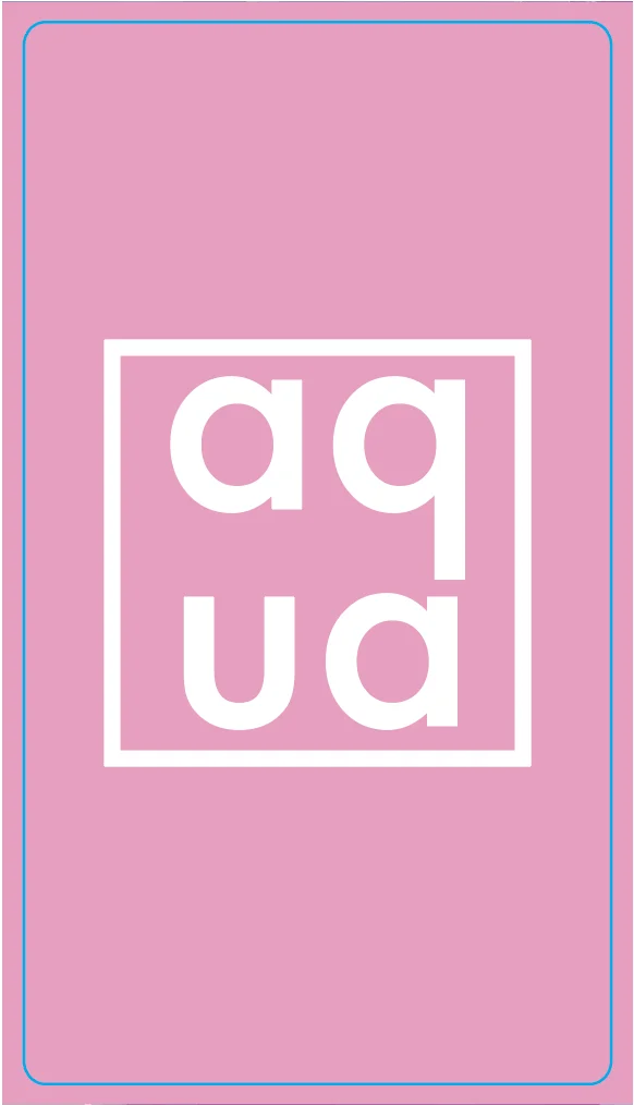 | 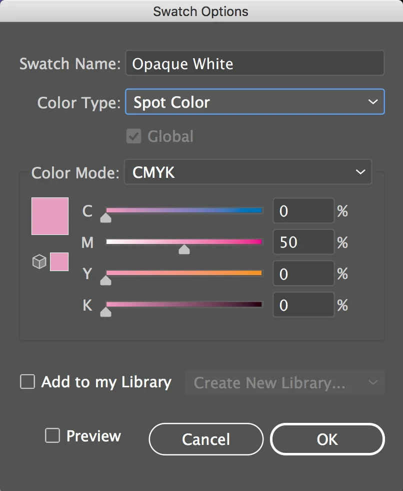 |
Step 4
|  |  | |
 |  |
Remember you can vary the percentage of opaque white:
- 100% – the layer will provide full coverage ‘under the ink colours’
- 99- 01% – it wil be gradually more transparent the less the %
- 0% – or no opaque white – means the inks will reflect the substrate below
 |  |  |
Opaque white layers are like the die-line (cutter) layer – produced separately and then switched on and off to highlight the final product.
Be sure to check-out some of the creative ways we use opaque white and be sure to ask us if you have any questions.


