No products in the cart.
What's Hot
PANTONE COLOR OF THE YEAR 2022 introducing Very Peri
PANTONE® COLOR OF THE YEAR 2022 is Pantone 17-3938 Very Peri
For the first time in their history, the Pantone Color Institute TM created a new colour.
A colour to encourage inventiveness and creativity in a world of unprecedented change.
Very Peri is the colour to reflect and represent what is taking place around the world.
PANTONE® 17-3938 Very Peri PMS: (closest match) Pantone 2116C |
USING VERY PERI IN LABELS, PACKAGING AND DESIGN
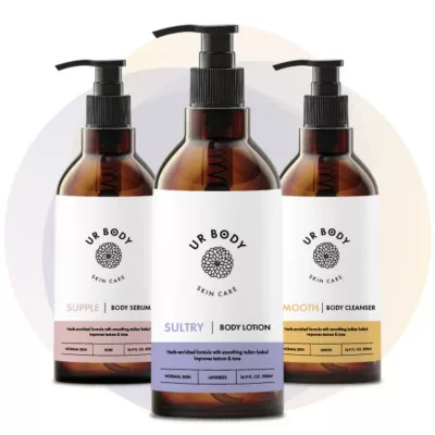
| Very Peri is posited as being reflective of the “transformative times” we are living in (some say ‘unprecedented’ or ‘unpredictable’) and this shade of purple (continuously referred to as a blue*, occasionally as ‘red violet infused blue’ – but it is definitely a purple!) is both inquisitive and intriguing, “helping us to embrace (or is it cope with) this altered landscape of possibilities, opening us up to a new vision as we rewrite our lives.”
* The name Very Peri is a nod to ‘Periwinkle’, derived from the herb known as ‘lesser periwinkle’ (myrtle) which bears flowers in that colour. Periwinkle is considered to be a pale tint, dare I say ‘pastel’ purple, even though it is often referred to as a blue (or a lavender blue). |
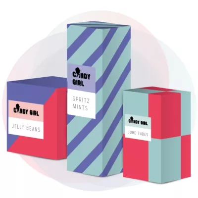
| Whilst we may not share the notions that it displays “a carefree confidence and daring curiosity that animates our creative spirit”, we agree that it really does aim to inspire creativity and an optimistic (if somewhat unknown) sense of possibility, by creating a colour that combines the calm stability of blue with the energy of red. It reinforces that we have to explore new possibilities, or look at the world with a new perspective.
What we do admire about the colour choice is that it acknowledges the ways we have been living and the complexities faced as people emerge into a very different world. For many of us, our physical and digital worlds have merged, often creating a whole new way of living, working and interacting. Pantone has cleverly used this as an opportunity to embrace the dynamic of the unknown by using a softer shade. |
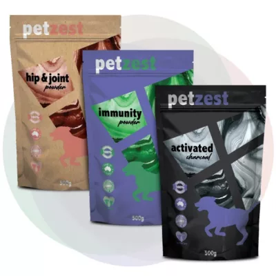
| Purples have always had a strong connection to ‘space’ and the surreal and as such are commonly used in gaming and digital mediums to reflect the unknown, the imagined or ‘out there’ as it was affectionately known. This colour will lend itself to a vast range of applications, from food and beverage items, to cosmetics and consumer goods. Its versatility and creative colour palettes will see Very Peri feature in fashion, furnishings and throughout a vast array of digital applications. Congratulations to the Pantone Color Institute for another stellar choice.
Explore the Pantone® Color of the Year 2022 Very Peri on Pantone’s official sites and share your designs using the hashtags #Pantone2022 #coloroftheyear |
Create with Pantone® 17-3938 VERY PERI
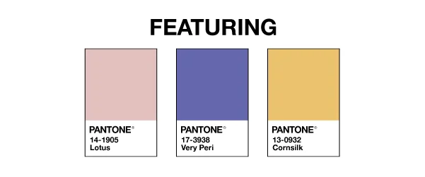
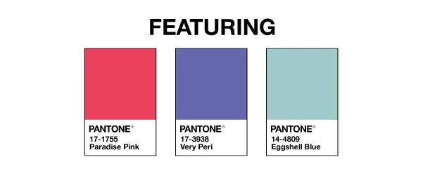
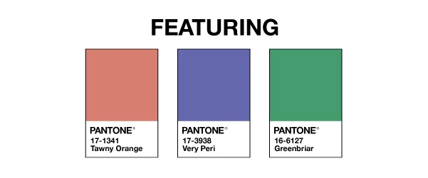
Pantone have created 4 unique colour palettes featuring PANTONE® 17-3938 Very Peri that allow designers and brand owners to incorporate this year’s colours into your designs. Each palette conveys a different mood, illustrating PANTONE® 17-3938 Very Peri’s versatility. The palettes also feature suggested colour combinations and weightings when integrating these colours together. Check them out below to see what colours are trending in design for 2022.
The easiest and FREE way to explore is using tools on Pantone Connect: a digital colour platform for designers available on web, via mobile apps, and as an extension for Adobe® Creative Cloud®. The tool includes pre-loaded Colour of the Year-themed palettes, along with every other Pantone Colour, and are available to share, save, and use in your design files within Adobe Photoshop®, Illustrator®, and InDesign®. With a free Pantone Connect account, designers can access many other time-saving features to find inspirational colours, save colour palettes, and design with achievable Pantone Colour. Be sure to check them out.
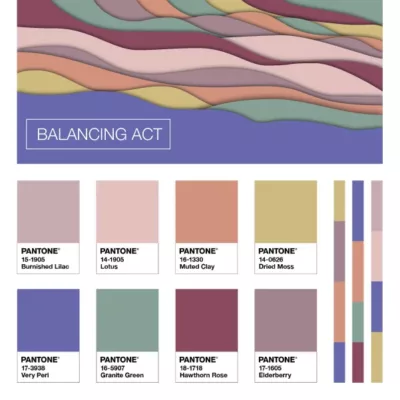 | BALANCING ACT Balancing Act is a complementary palette of colour whose natural balance of warm and cool tones support and enhance one other. The brilliance of PANTONE 17-3938 Very Peri is intensified within this artfully calibrated palette, injecting a feeling of liveliness and visual vibration. |
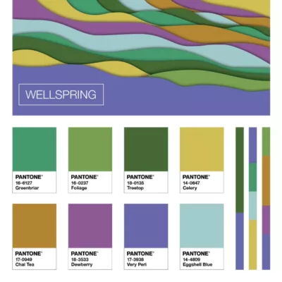 | WELLSPRING A holistic and harmonious blend of nature infused shades, Wellspring highlights the compatibility of the greens with good-natured PANTONE 17-3938 Very Peri, and the health-giving properties of these deliciously subtle and nourishing hues. |
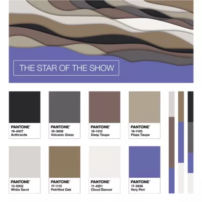 | THE STAR OF THE SHOW The dynamic presence of PANTONE 17-3938 Very Peri comes through in The Star of the Show, as we surround this happiest and warmest of all the blue hues with a palette of classics and neutrals whose essence of elegance and understated stylishness convey a message of timeless sophistication. |
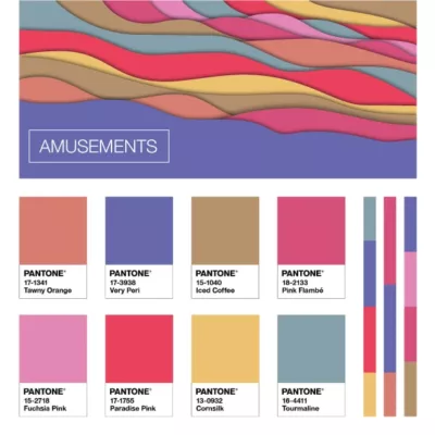 | AMUSEMENTS Amusements, a joyous and whimsical colour story of irrepressible fun and spontaneity is amplified by the carefree confidence and joyful attitude of PANTONE Color of the Year 2002 17-3938 Very Peri, a twinkling blue hue whose playfulness emboldens uninhibited expression and experimentation. |


